

2024 | RESEARCH | UX | UI
leoBetz.com
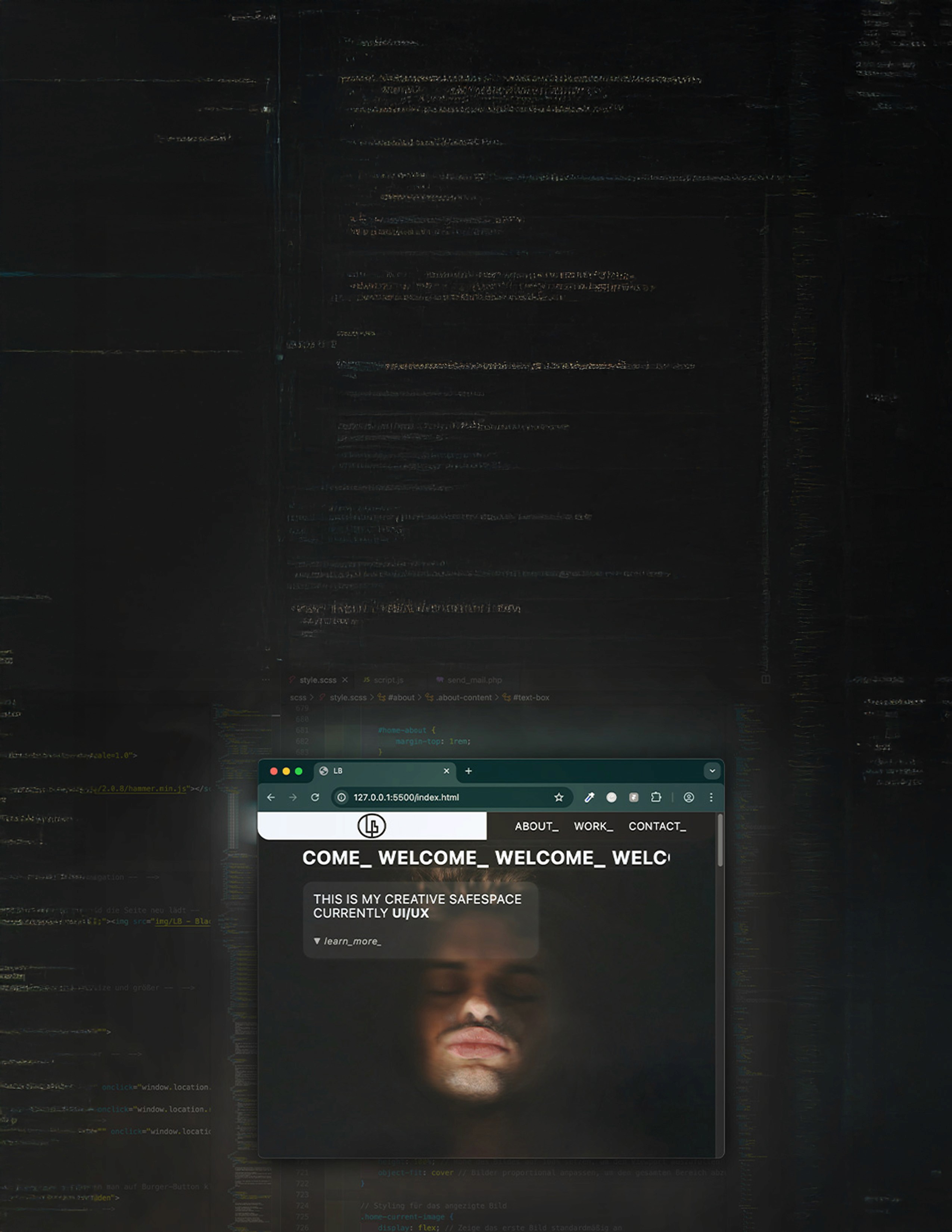
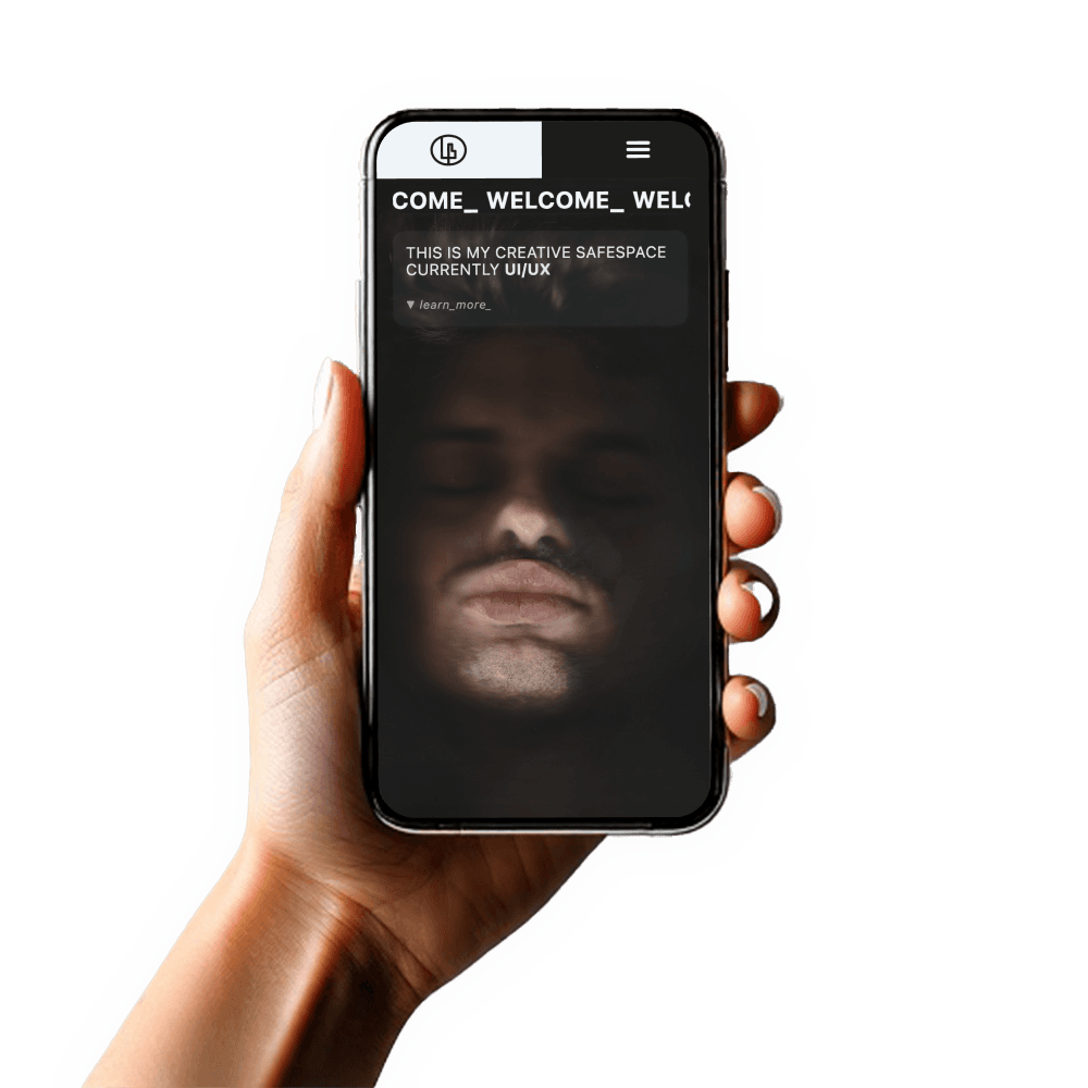
Hand-coded
Portfolio website
This was my first fully self-developed
portfolio website – a project where I handled
everything from concept and design
to development and deployment.
My goal was to showcase my UX/UI work
while deepening my understanding
of web development.
2024 | RESEARCH | UX | UI
2024 | RESEARCH | UX | UI
leoBetz.com
leoBetz.com
Hand-coded
Portfolio website
Hand-coded
Portfolio website
This was my first fully self-developed
portfolio website – a project where I handled everything from concept and design to development and deployment.
This was my first fully self-developed
portfolio website – a project where I handled everything from concept and design to development and deployment.
My goal was to showcase my UX/UI work while deepening my understanding of web development.
My goal was to showcase my UX/UI work while deepening my understanding of web development.
PROBLEM STATEMENT
PROBLEM STATEMENT
PROBLEM STATEMENT
Creating a portfolio website that not only presents my work
but also reflects my design thinking, technical skills,
and professional identity was a major challenge..
Creating a portfolio website that not only presents my work
but also reflects my design thinking, technical skills,
and professional identity was a major challenge..
Creating a portfolio website that not only presents my work
but also reflects my design thinking, technical skills,
and professional identity was a major challenge..
I needed a platform that would make recruiters instantly recognise
me as a strong UX/UI candidate.
I needed a platform that would make recruiters instantly recognise me as a strong UX/UI candidate.
I needed a platform that would make recruiters instantly recognise
me as a strong UX/UI candidate.
Challenge
Challenge
Challenge
Balancing aesthetic design with functionality was tough,
especially while coding everything from scratch
Balancing aesthetic design with functionality was tough,
especially while coding everything from scratch
Balancing aesthetic design with functionality was tough,
especially while coding everything from scratch
I also had to figure out how to structure my content
in a way that told a clear user-centered story
and stood out in a competitive job market.
I also had to figure out how to structure my content
in a way that told a clear user-centered story
and stood out in a competitive job market.
I also had to figure out how to structure my content
in a way that told a clear user-centered story
and stood out in a competitive job market.
POSSIBLE SOLUTION
POSSIBLE SOLUTION
POSSIBLE SOLUTION
Through user research, continuous iteration,
and testing with peers, I developed a responsive, intuitive site
that aligns with both UX principles and modern web standards.
Through user research, continuous iteration,
and testing with peers, I developed a responsive,
intuitive site that aligns with both UX principles
and modern web standards.
Through user research, continuous iteration,
and testing with peers, I developed a responsive, intuitive site
that aligns with both UX principles and modern web standards.
By combining visual hierarchy, micro-interactions,
and clean front-end development, I created a portfolio
that feels authentic and professional.
By combining visual hierarchy, micro-interactions,
and clean front-end development, I created a portfolio
that feels authentic and professional.
By combining visual hierarchy, micro-interactions,
and clean front-end development, I created a portfolio
that feels authentic and professional.
Background
Background
Background
After completing several UX/UI projects,
I wanted a space that truly showcased my design process,
my growth, and my personality as a designer.
After completing several UX/UI projects,
I wanted a space that truly showcased my design process,
my growth, and my personality as a designer.
After completing several UX/UI projects,
I wanted a space that truly showcased my design process,
my growth, and my personality as a designer.
I decided to build my own portfolio website from scratch
to combine my creative vision with technical execution
and to stand out with something that felt uniquely mine.
I decided to build my own portfolio website from scratch
to combine my creative vision with technical execution
and to stand out with something that felt uniquely mine.
I decided to build my own portfolio website from scratch
to combine my creative vision with technical execution
and to stand out with something that felt uniquely mine.
Team
Team
Team
Solo Project
Solo Project
Solo Project
My Role
My Role
My Role
UX Researcher
UX Researcher
UX Researcher
UX Designer
UX Designer
UX Designer
UI Designer
UI Designer
UI Designer
Brand Designer
Brand Designer
Brand Designer
Illustrator
Illustrator
Illustrator
Frontend Developer
Frontend Developer
Frontend Developer
Content Strategist
Content Strategist
Content Strategist
Project Manager
Project Manager
Project Manager
Project Duration
Project Duration
Project Duration
2
2
2
weeks
weeks
7
7
7
Sections
Sections
tools used
tools used
tools used
Figma
Figma

Sketch
Sketch

Adobe Photoshop
Adobe Photoshop

Adobe Illustrator
Adobe Illustrator

Procreate
Procreate

Visual Studio Code
Visual Studio Code

HTML
HTML
SCSS
SCSS

JavaScript
JavaScript

GitHub
GitHub

ChatGPT
ChatGPT

Adobe Firefly
Adobe Firefly
process
process
design process
Discover
Discover
Discover
I researched current UX portfolio trends
and reviewed recruiter expectations to understand
what makes a portfolio effective.
I researched current UX portfolio trends
and reviewed recruiter expectations to understand
what makes a portfolio effective.
I researched current UX portfolio trends
and reviewed recruiter expectations to understand
what makes a portfolio effective.
This helped me define a clear goal
and target audience for my own site.
This helped me define a clear goal
and target audience for my own site.
This helped me define a clear goal
and target audience for my own site.
Define
Define
Define
I created a solid content structure with a clear sitemap
and defined the core narrative of my personal brand.
I created a solid content structure
with a clear sitemap and defined
the core narrative of my personal brand.
I created a solid content structure with a clear sitemap
and defined the core narrative of my personal brand.
I also designed a custom logo
and built a consistent visual identity
that reflects my design personality.
I also designed a custom logo
and built a consistent visual identity
that reflects my design personality.
I also designed a custom logo
and built a consistent visual identity
that reflects my design personality.
Ideate
Ideate
Ideate
I combined visual concepting with technical planning —
sketching layouts, interaction ideas, and moodboards,
while also mapping out the HTML structure,
SCSS setup, and JS functionality.
I combined visual concepting with technical
planning — sketching layouts, interaction ideas,
and moodboards, while also mapping out the HTML structure, SCSS setup, and JS functionality.
This helped me stay organized and focused while coding,
ensuring that my design ideas were realistic,
responsive, and easy to maintain.
This helped me stay organized and focused
while coding, ensuring that my design ideas
were realistic, responsive, and easy to maintain.
Design
Design
Design
I developed high-fidelity UI screens that followed strong visual hierarchy,
accessibility principles, and responsive design.
I developed high-fidelity UI screens that followed strong visual hierarchy, accessibility principles,
and responsive design.
I developed high-fidelity UI screens that followed strong visual hierarchy,
accessibility principles, and responsive design.
I then brought the vision to life by hand-coding the entire site
using HTML, CSS, and JavaScript.
I then brought the vision to life by hand-coding the entire site using HTML, CSS, and JavaScript.
I then brought the vision to life by hand-coding the entire site
using HTML, CSS, and JavaScript.
Test
Test
Test
I tested the website across multiple devices and browsers,
gathering feedback from peers and mentors.
I tested the website across multiple devices and browsers,
gathering feedback from peers and mentors.
I tested the website across multiple devices and browsers,
gathering feedback from peers and mentors.
Based on this, I iterated on performance, usability,
and overall user experience.
Based on this, I iterated on performance, usability,
and overall user experience.
Based on this, I iterated on performance, usability,
and overall user experience.
Discover PHASE
Discover PHASE
Discover PHASE
Results & Findings
Results & Findings
Results & Findings
Most recruiters and hiring managers expect portfolios to be clear,
fast to navigate, and focused on process, not just visuals.
Most recruiters and hiring managers expect
portfolios to be clear, fast to navigate, and focused on process, not just visuals.
Most recruiters and hiring managers expect portfolios to be clear,
fast to navigate, and focused on process, not just visuals.
Many UX portfolios lacked a personal brand
or failed to communicate the designer’s unique personality and strengths.
Many UX portfolios lacked a personal brand
or failed to communicate the designer’s
unique personality and strengths.
Many UX portfolios lacked a personal brand
or failed to communicate the designer’s unique personality and strengths.
The strongest portfolios combined custom design elements
(like logos or illustrations) with practical, real-world case studies.
The strongest portfolios combined custom design elements with practical, real-world case studies.
The strongest portfolios combined custom design elements
(like logos or illustrations) with practical, real-world case studies.
Recruiters spend on average 1–3 minutes on a first portfolio visit,
so a simple, intuitive structure is essential.
Recruiters spend on average 1–3 minutes on a first portfolio visit, so a simple, intuitive structure
is essential.
Recruiters spend on average 1–3 minutes on a first portfolio visit,
so a simple, intuitive structure is essential.
A noticeable demand for responsive, mobile-friendly portfolios
with micro-interactions and modern UX patterns.
A noticeable demand for responsive,
mobile-friendly portfolios with micro-interactions
and modern UX patterns.
A noticeable demand for responsive, mobile-friendly portfolios
with micro-interactions and modern UX patterns.
Junior UX/UI designers often focus too much on visuals
and too little on storytelling, decision-making, and process clarity.
Junior UX/UI designers often focus too much on visuals and too little on storytelling, decision-making,
and process clarity.
Junior UX/UI designers often focus too much on visuals
and too little on storytelling, decision-making, and process clarity.
What Recruiters Expect
What Recruiters Expect
What Recruiters Expect

Clear navigation
Clear navigation
Clear navigation
Process-focused case studies
Process-focused case studies
Process-focused case studies
Personal Branding and personality
Personal Branding and personality
Personal Branding and personality
Mobil-friendly, responsive design
Mobil-friendly, responsive design
Mobil-friendly, responsive design
Modern UX patterns and micro-interactions
Modern UX patterns and micro-interactions
Modern UX patterns and micro-interactions
Quick scan time: 1-3 minutes
Quick scan time: 1-3 minutes
Quick scan time: 1-3 minutes
Common Portfolio Mistakes
Common Portfolio Mistakes
Common Portfolio Mistakes

Too much focus on visuals,
not enough on process and decision-making
Too much focus on visuals,
not enough on process and decision-making
Too much focus on visuals,
not enough on process and decision-making
Weak or missing storytelling
Weak or missing storytelling
Weak or missing storytelling
Lack of personal brand or individuality
Lack of personal brand or individuality
Lack of personal brand or individuality
Overcomplicated, confusing structure
Overcomplicated, confusing structure
Overcomplicated, confusing structure
My Takeaways
My Takeaways
My Takeaways
Create a personal, process-driven portfolio
Create a personal, process-driven portfolio
Create a personal, process-driven portfolio
Balance creativity with clarity
Balance creativity with clarity
Balance creativity with clarity
Showcase UX decision-making and outcomes
Showcase UX decision-making and outcomes
Showcase UX decision-making and outcomes
Make the experience fast, intuitive, and visually engaging
Make the experience fast, intuitive, and visually engaging
Make the experience fast, intuitive, and visually engaging
define PHASE
define PHASE
define PHASE
What i did
What i did
What i did
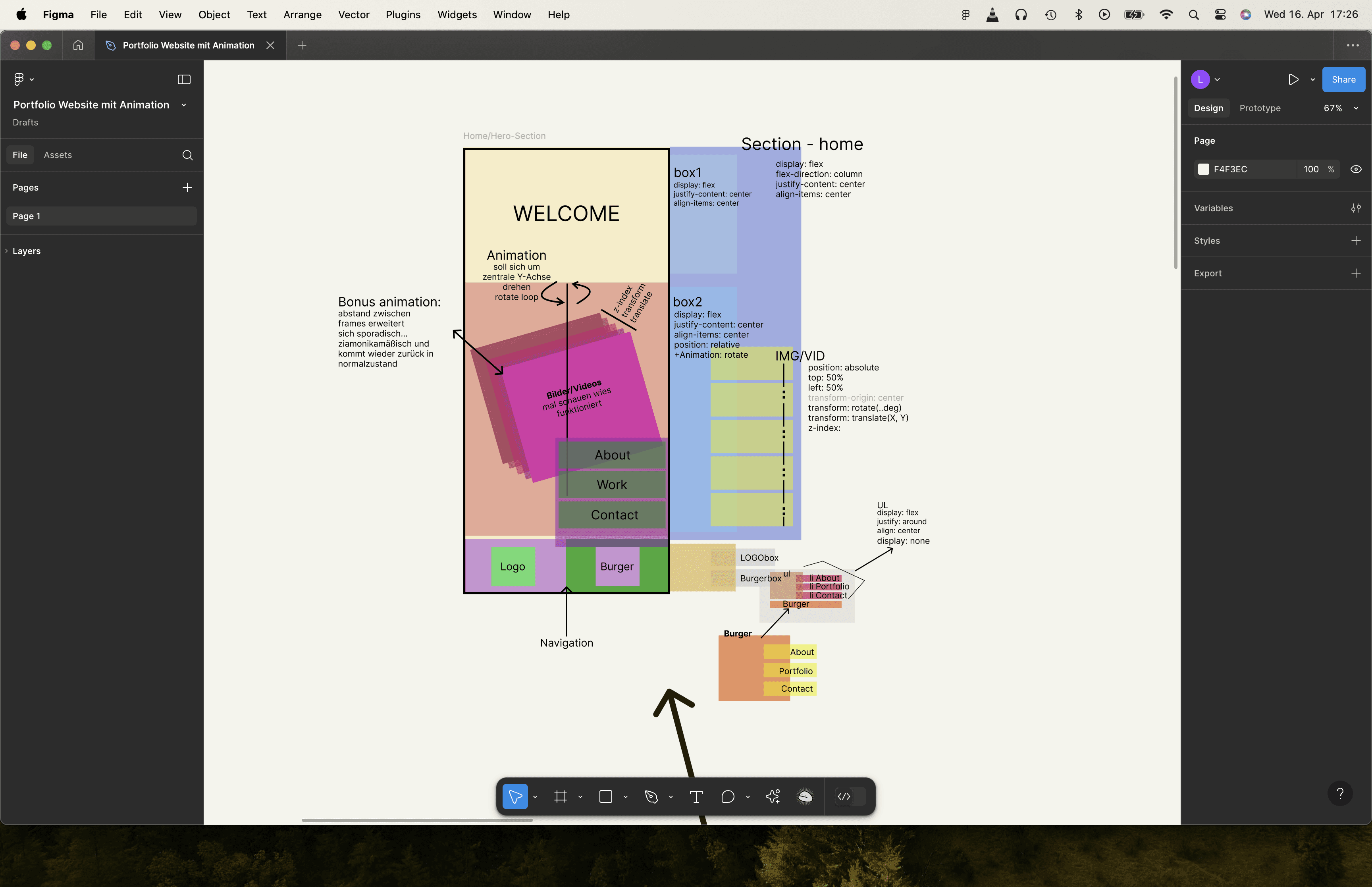
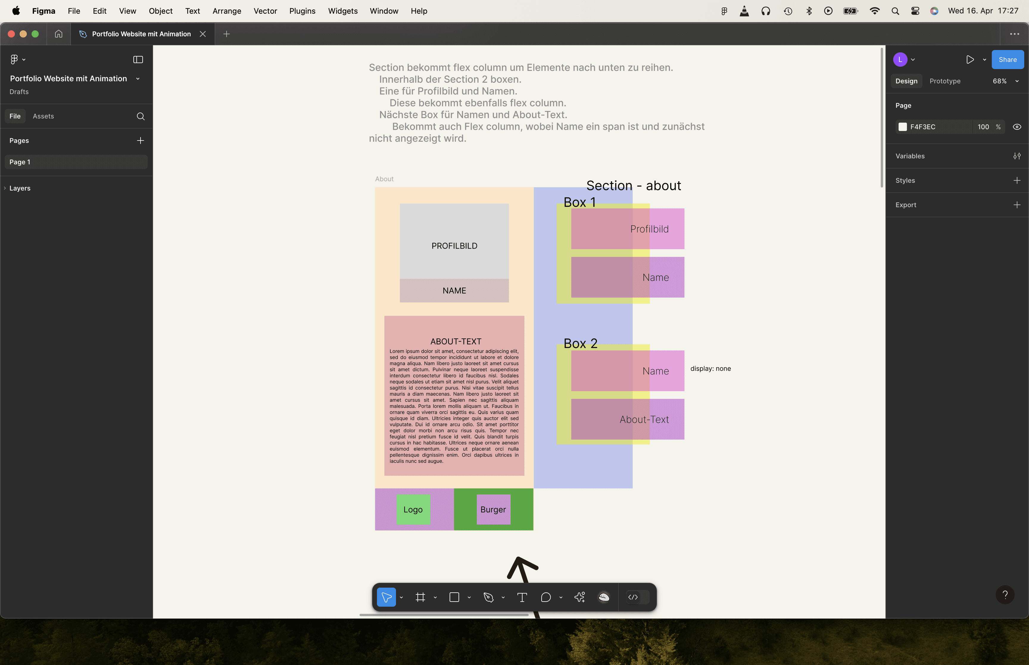
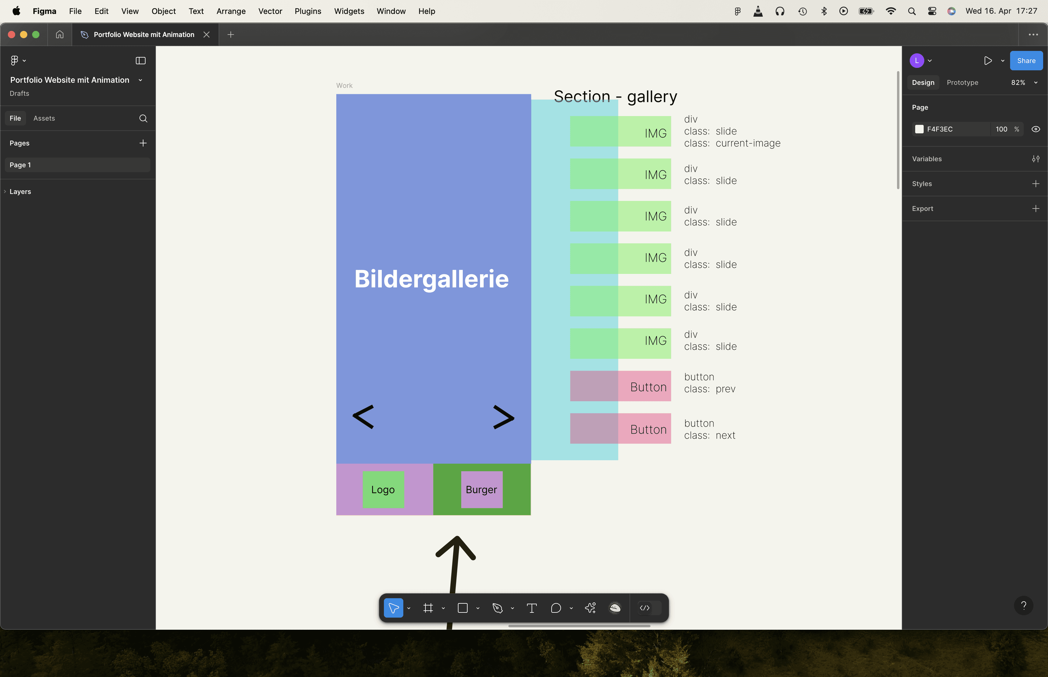
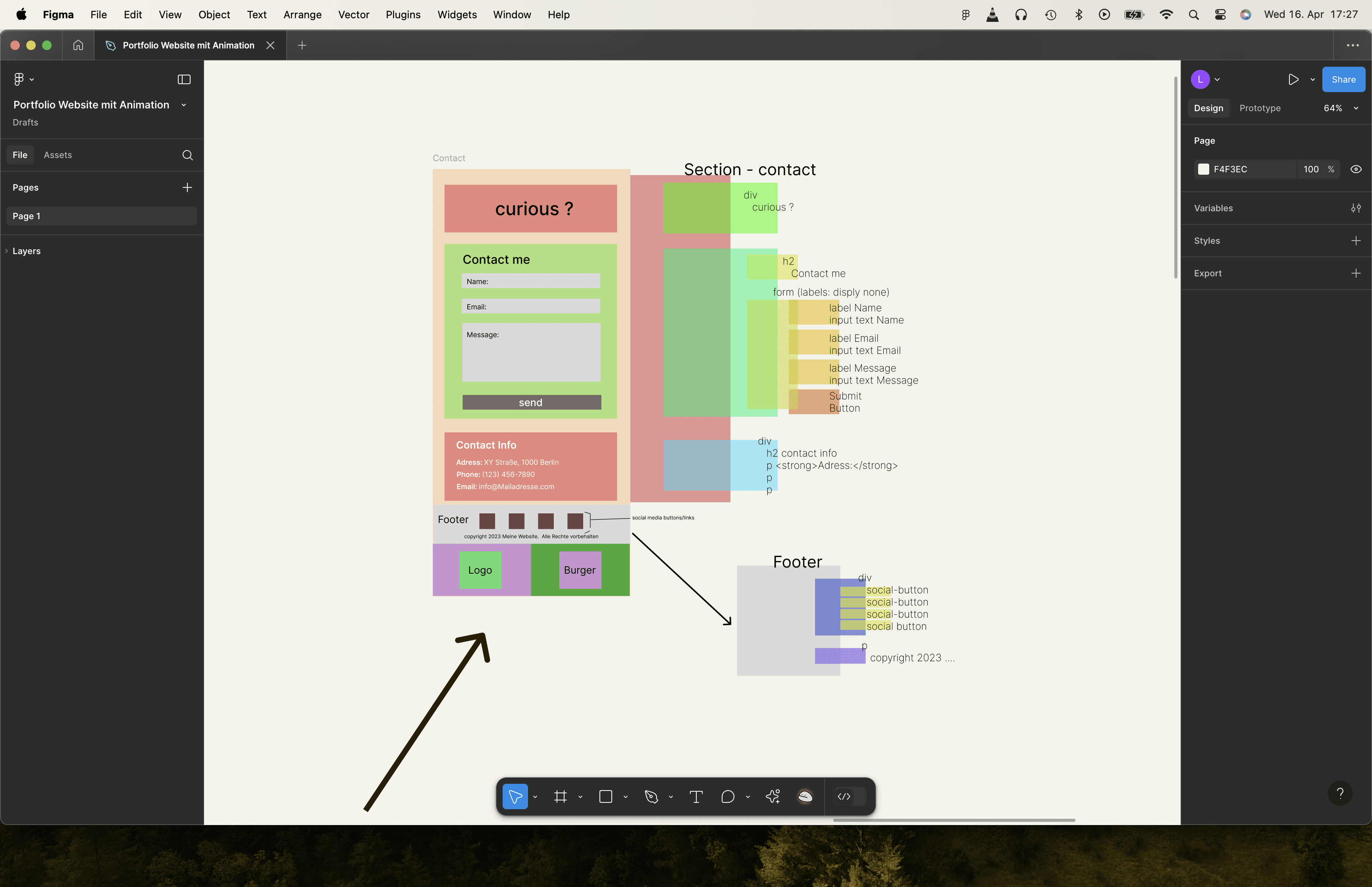
Structured the portfolio into four key sections:
→ Home (Hero) — immediate intro to who I am, what I do, and quick access to my projects
→ About — personal intro, skills, brand
→ Work — case studies with the UX process inside each project
→ Contact — simple, clear way to connect
Structured the portfolio into four key sections:
→ Home (Hero) — immediate intro to who I am,
what I do, and quick access to my projects
→ About — personal intro, skills, brand
→ Work — case studies with the UX processinside each project
→ Contact — simple, clear way to connect
Structured the portfolio into four key sections:
→ Home (Hero) — immediate intro to who I am, what I do, and quick access to my projects
→ About — personal intro, skills, brand
→ Work — case studies with the UX process inside each project
→ Contact — simple, clear way to connect
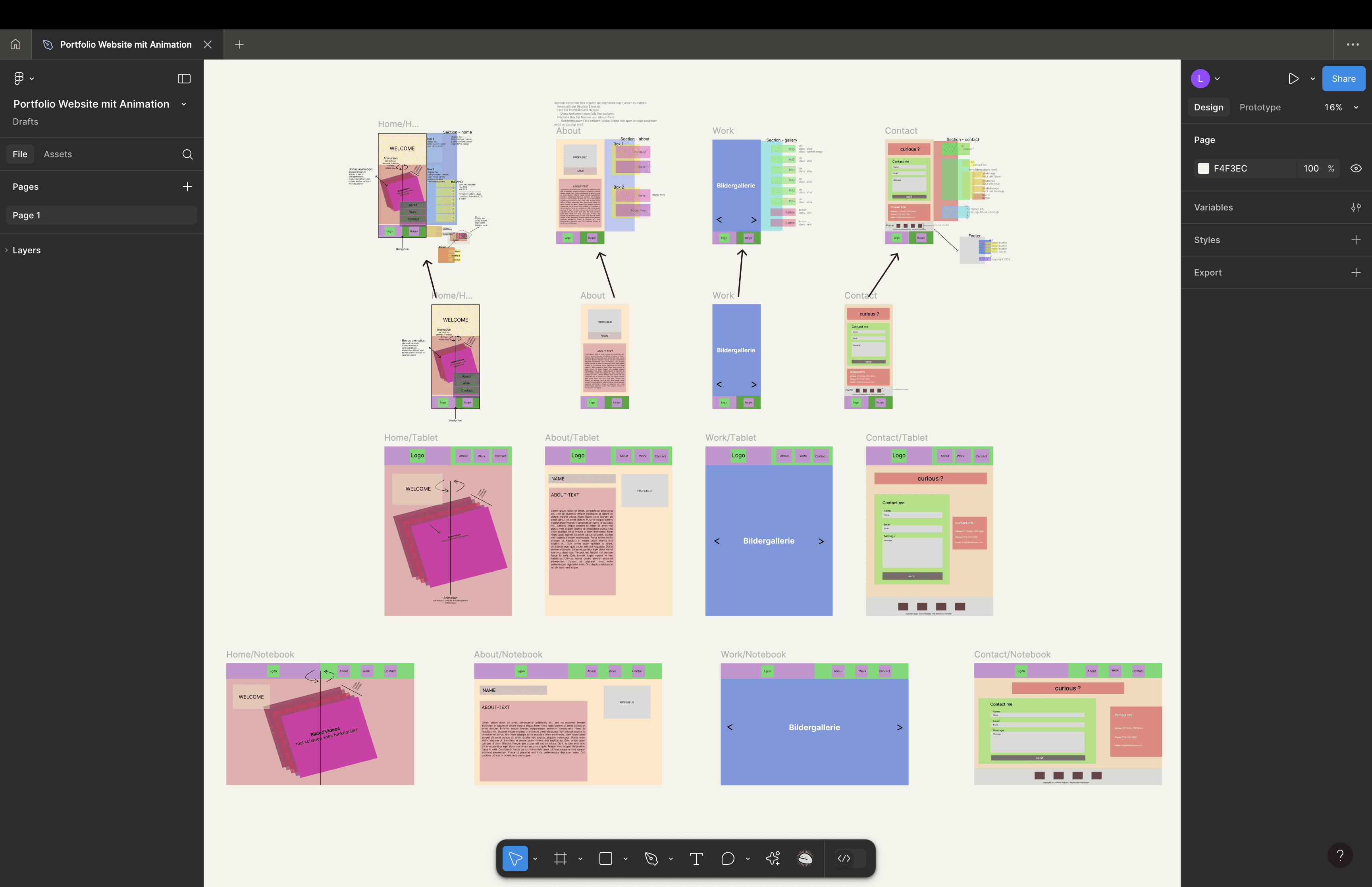
Designed a mobile-first sitemap and carefully mapped out
the technical requirements for each section in Figma.
Designed a mobile-first sitemap
and carefully mapped out the technical
requirements for each section in Figma.
Designed a mobile-first sitemap and carefully mapped out
the technical requirements for each section in Figma.
Chose to build the site with SCSS instead of Tailwind,
even though I had already learned it — because I wanted to:
→ Deepen my understanding of CSS structure
→ Build my own custom framework
→ Use mixins, variables, and breakpoints for clean, reusable, responsive code
Chose to build the site with SCSS
instead of Tailwind, even though I had
already learned it — because I wanted to:
→ Deepen my understanding of CSS structure
→ Build my own custom framework
→ Use mixins, variables, and breakpoints for clean
reusable, responsive code
Chose to build the site with SCSS instead of Tailwind,
even though I had already learned it — because I wanted to:
→ Deepen my understanding of CSS structure
→ Build my own custom framework
→ Use mixins, variables, and breakpoints for clean, reusable, responsive code
Why this matters
Why this matters
Why this matters
Makes the site fast, intuitive, and purpose-driven for recruiters
Makes the site fast, intuitive,
and purpose-driven for recruiters
Makes the site fast, intuitive, and purpose-driven for recruiters
Combines user-centered content structure with a scalable, mobile-friendly code system
Combines user-centered content structure with a scalable, mobile-friendly code system
Combines user-centered content structure with a scalable, mobile-friendly code system
Gave me valuable hands-on experience in front-end structuring and custom framework building
Gave me valuable hands-on experience in front-end structuring and custom framework building
Gave me valuable hands-on experience in front-end structuring and custom framework building
Ideate PHASE
Ideate PHASE
Ideate PHASE
What i did
What i did
What i did
Visual code structure
Visual code structure
Sketched out multiple layout ideas for the Hero,
About, Work, and Contact sections based on
the user priorities and content structure defined earlier
Most recruiters and hiring managers expect
portfolios to be clear, fast to navigate, and focused on process, not just visuals.
Sketched out multiple layout ideas for the Hero,
About, Work, and Contact sections based on
the user priorities and content structure defined earlier
Explored different navigation concepts
(top nav, sticky nav, minimal hamburger on mobile)
to create smooth, intuitive user journeys.
Many UX portfolios lacked a personal brand
or failed to communicate the designer’s
unique personality and strengths.
Explored different navigation concepts
(top nav, sticky nav, minimal hamburger on mobile)
to create smooth, intuitive user journeys.
Brainstormed interaction patterns like hover states,
animations, and micro-interactions that would enhance
usability without overwhelming the content.
The strongest portfolios combined custom design elements with practical, real-world case studies.
Brainstormed interaction patterns like hover states,
animations, and micro-interactions that would enhance
usability without overwhelming the content.
Created visual moodboards and drafted a style direction
with typography, colors, and spacing to reflect my personal brand.
The strongest portfolios combined custom design elements with practical, real-world case studies.
Created visual moodboards and drafted a style direction
with typography, colors, and spacing to reflect my personal brand.
Planned the code structure in parallel:
→ Listed the HTML elements, components,and classes I would need
→ Sketched how to organise SCSS files and code elements
→ Mapped JS interactions for animationsand responsive behavior
→ This helped me stay organised and avoid getting lost
in the code while turning ideas into reality.
Recruiters spend on average 1–3 minutes on a first portfolio visit, so a simple, intuitive structure is essential.
Planned the code structure in parallel:
→ Listed the HTML elements, components,and classes I would need
→ Sketched how to organise SCSS files and code elements
→ Mapped JS interactions for animationsand responsive behavior
→ This helped me stay organised and avoid getting lost
in the code while turning ideas into reality.
Why this matters
Why this matters
Why this matters
Ensured that design ideas were technically achievable
within a clear, maintainable code structure.
Ensured that design ideas were technically achievable
within a clear, maintainable code structure.
Ensured that design ideas were technically achievable
within a clear, maintainable code structure.
Balanced UX/UI creativity with practical, scalable code planning.
Balanced UX/UI creativity with practical,
scalable code planning.
Balanced UX/UI creativity with practical, scalable code planning.
Gave me a clear technical roadmap alongside visual concepts,
keeping the project focused and structured from start to finish.
Gave me a clear technical roadmap alongside visual concepts, keeping the project focused
and structured from start to finish.
Gave me a clear technical roadmap alongside visual concepts,
keeping the project focused and structured from start to finish.
Design PHASE
Design PHASE
Design PHASE
What i did
What i did
What i did
Coded the entire portfolio from scratch in Visual Studio Code,
following the layout, code structure, and interaction concepts
I had planned during the Ideate phase.
Coded the entire portfolio from scratch
in Visual Studio Code, following the layout,
code structure, and interaction concepts
I had planned during the Ideate phase.
Coded the entire portfolio from scratch in Visual Studio Code,
following the layout, code structure, and interaction concepts
I had planned during the Ideate phase.
Used the Live Server / Go Live function in VS Code
to continuously test the website in real-time on
different screen sizes and device
Used the Live Server / Go Live function in VS Code
to continuously test the website in real-time on
different screen sizes and device.
Used the Live Server / Go Live function in VS Code
to continuously test the website in real-time on
different screen sizes and device
Focused on creating a fast, responsive, and visually clean website
that stays true to my visual identity while providing a smooth, intuitive user experience.
Focused on creating a fast, responsive,
and visually clean website that stays true
to my visual identity while providing a smooth,
intuitive user experience.
Focused on creating a fast, responsive, and visually clean website
that stays true to my visual identity while providing a smooth, intuitive user experience.
Integrated UX improvements during testing, including:
→ Moving the navigation bar to the bottom on mobile
for better thumb control and accessibility.
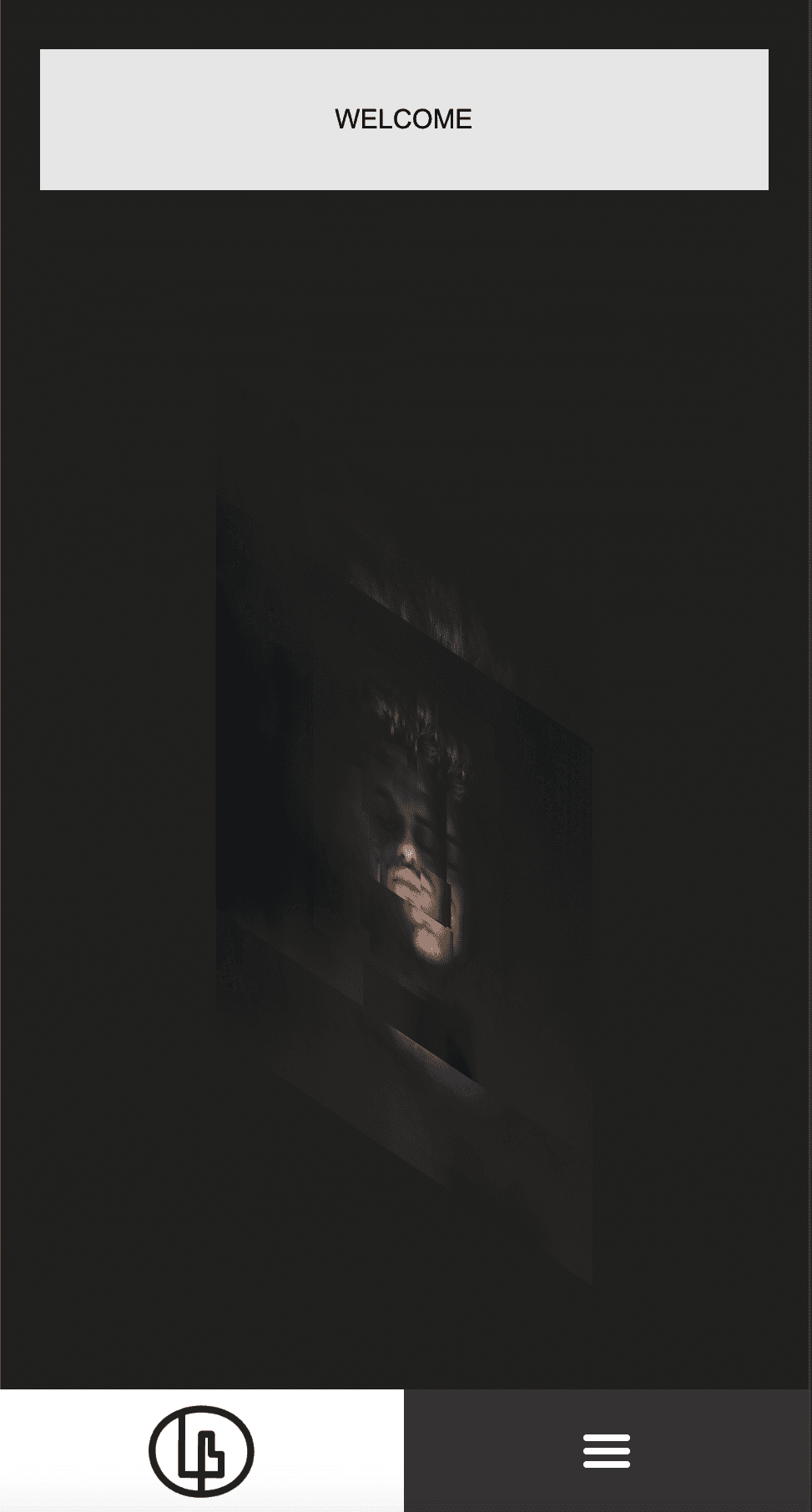
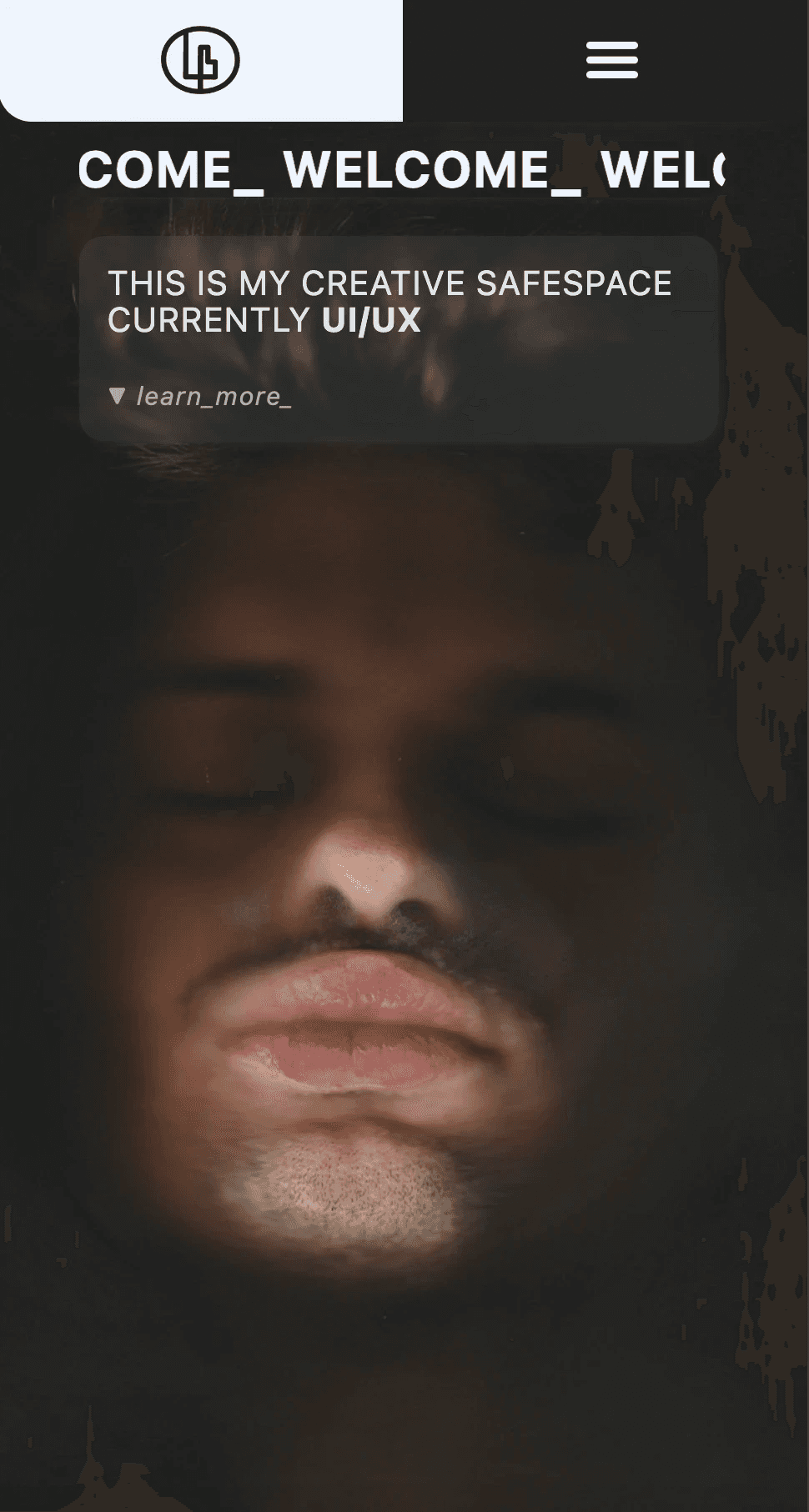
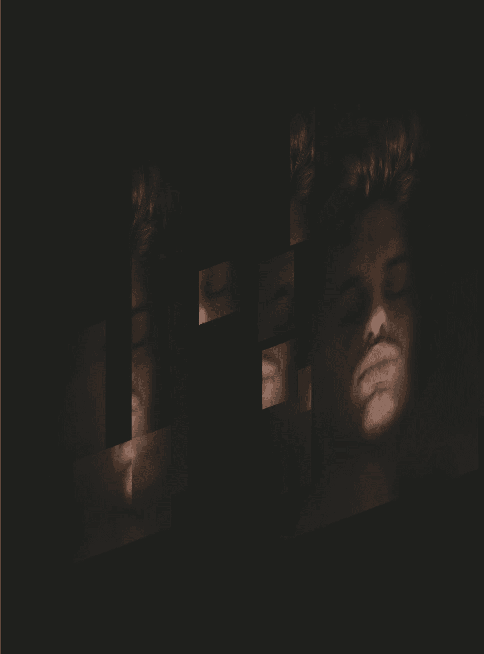
→ Implemented an layer-revealing animation in the Hero section— visualising the concept that every digital interface is built in layers.
Integrated UX improvements during testing, including:
→ Moving the navigation bar to the bottom
on mobile for better thumb control
and accessibility.
→ Implemented an layer-revealing animationin the Hero section — visualising the concept
that every digital interface is built in layers.
Integrated UX improvements during testing, including:
→ Moving the navigation bar to the bottom on mobile
for better thumb control and accessibility.
→ Implemented an layer-revealing animation in the Hero section— visualising the concept that every digital interface is built in layers.
Made small iterations and optimisations along the way, directly in code,
improving layout, animations, and responsiveness based on real-time tests and feedback.
Made small iterations and optimisations
along the way, directly in code, improving layout, animations, and responsiveness based
on real-time tests and feedback.
Made small iterations and optimisations along the way, directly in code,
improving layout, animations, and responsiveness based on real-time tests and feedback.
Why this matters
Why this matters
Why this matters
Ensured that the portfolio was technically stable, responsive, and fast before final optimization.
Ensured that the portfolio was technically stable, responsive, and fast before final optimization.
Ensured that the portfolio was technically stable, responsive, and fast before final optimization.
Allowed me to test and improve the user experience on the fly, speeding up the iteration process.
Allowed me to test and improve the user experience
on the fly, speeding up the iteration process.
Allowed me to test and improve the user experience on the fly, speeding up the iteration process.
Strengthened my workflow by combining design implementation, live testing,
and UX refinement in parallel — just like in a professional product team setup.
Strengthened my workflow by combining design implementation, live testing, and UX refinement
in parallel — just like in a professional
product team setup.
Strengthened my workflow by combining design implementation, live testing,
and UX refinement in parallel — just like in a professional product team setup.
Used animation not just decoratively, but to tell a visual story about layered design thinking.
Used animation not just decoratively, but to tell a visual story about layered design thinking.
Used animation not just decoratively, but to tell a visual story about layered design thinking.
First Test-ready version
First Test-ready version
First Test-ready version
A short screen recording of the first fully coded, test-ready version of my portfolio — showing:
A short screen recording of the first fully coded, test-ready version of my portfolio — showing:
A short screen recording of the first fully coded, test-ready version of my portfolio — showing:
Basic layout structure
Basic layout structure
Basic layout structure
A layer-revealing animation in the hero section
to visualise the concept of layered design and development
A layer-revealing animation in the hero section
to visualise the concept of layered design and development
A layer-revealing animation in the hero section
to visualise the concept of layered design and development
Responsive breakpoints in action (mobile, tablet, desktop)
Responsive breakpoints in action (mobile, tablet, desktop)
Responsive breakpoints in action (mobile, tablet, desktop)
Navigation flow – I moved the navigation bar to the bottom of the screen
for better thumb control and easier, natural interaction
Navigation flow – I moved the navigation bar to the bottom of the screen
for better thumb control and easier, natural interaction
Navigation flow – I moved the navigation bar to the bottom of the screen
for better thumb control and easier, natural interaction
Hero, About, Work, and Contact sections working together
Hero, About, Work, and Contact sections working together
Hero, About, Work, and Contact sections working together
Test PHASE
Test PHASE
Test PHASE
What i did
What i did
What i did
Populated the website with realistic, relevant content to test
how well the layout, structure, and interactions worked with actual material.
Most recruiters and hiring managers expect
portfolios to be clear, fast to navigate, and focused on process, not just visuals.
Populated the website with realistic, relevant content to test
how well the layout, structure, and interactions worked with actual material.
Conducted usability tests with multiple testers on mobile, tablet,
and desktop devices to identify issues, pain points, and improvement opportunities.
Many UX portfolios lacked a personal brand
or failed to communicate the designer’s
unique personality and strengths.
Conducted usability tests with multiple testers on mobile, tablet,
and desktop devices to identify issues, pain points, and improvement opportunities.
Key Findings & Iterations
Key Findings & Iterations
Key Findings & Iterations
Navigation Placement on Mobile:
Navigation Placement on Mobile:
Navigation Placement on Mobile:
While placing the navigation bar at the bottom of the screen initially
followed mobile app ergonomics, testers found this confusing
in a web context.
While placing the navigation bar at the bottom
of the screen initially followed mobile app ergonomics, testers found this confusing
in a web context.
While placing the navigation bar at the bottom of the screen initially
followed mobile app ergonomics, testers found this confusing
in a web context.
They expected the navigation to be at the top of the screen,
aligning with common website patterns.
They expected the navigation to be at the top of the screen, aligning with common website patterns.
They expected the navigation to be at the top of the screen,
aligning with common website patterns.
Action: I repositioned the navigation to the top on mobile
to meet user expectations and maintain consistency
with established web usability conventions.
Action: I repositioned the navigation to the top on mobile to meet user expectations and maintain consistency with established
web usability conventions.
Action: I repositioned the navigation to the top on mobile
to meet user expectations and maintain consistency
with established web usability conventions.
before
before
before
after
after
after
Project Presentation Format:
Project Presentation Format:
Project Presentation Format:
My initial idea of presenting projects via a gallery-style slideshow
didn’t effectively communicate my UX/UI process,
decision-making, and project depth.
My initial idea of presenting projects
via a gallery-style slideshow didn’t effectively communicate my UX/UI process,
decision-making, and project depth.
My initial idea of presenting projects via a gallery-style slideshow
didn’t effectively communicate my UX/UI process,
decision-making, and project depth.
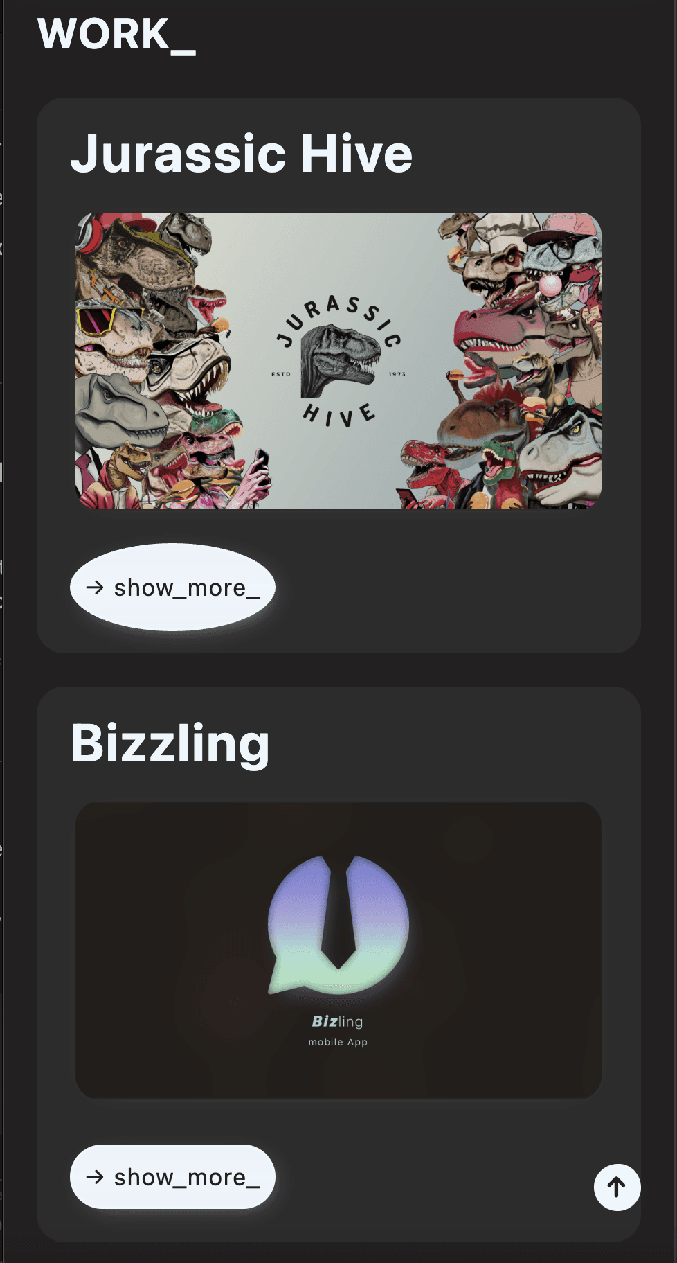
Action: I restructured the Work section to allow for detailed
project case studies, providing context, process descriptions,
and decision rationales — helping recruiters and hiring managers
better evaluate my skills and thought process.
Action: I restructured the Work section
to allow for detailed project case studies,
providing context, process descriptions,
and decision rationales — helping recruiters
and hiring managers better evaluate my skills
and thought process.
Action: I restructured the Work section to allow for detailed
project case studies, providing context, process descriptions,
and decision rationales — helping recruiters and hiring managers
better evaluate my skills and thought process.
before
before
before
after
after
after
Hero Animation Adjustment:
Hero Animation Adjustment:
Hero Animation Adjustment:
Although the layer-revealing animation in the Hero section
was a valuable coding and learning experience,
usability tests revealed it felt overly playful,
distracted from the portfolio’s primary message
and created unnecessary visual noise at the start of the user journey.
Although the layer-revealing animation in the Hero section was a valuable coding and learning experience, usability tests revealed it felt overly playful, distracted from the portfolio’s primary message and created unnecessary visual noise
at the start of the user journey.
Although the layer-revealing animation in the Hero section
was a valuable coding and learning experience,
usability tests revealed it felt overly playful,
distracted from the portfolio’s primary message
and created unnecessary visual noise at the start of the user journey.
Action: I decided to remove the animation and retain
the expressive hero image as a static visual.
Action: I decided to remove the animation and retain
the expressive hero image as a static visual.
This maintained the creative, attention-grabbing concept, while ensuring that the focus
remained on content clarity, hierarchy,
and professional presentation.
Action: I decided to remove the animation and retain
the expressive hero image as a static visual.
This maintained the creative, attention-grabbing concept,
while ensuring that the focus remained on content clarity,
hierarchy, and professional presentation.
Action: I decided to remove the animation and retain
the expressive hero image as a static visual.
This maintained the creative, attention-grabbing concept, while ensuring that the focus
remained on content clarity, hierarchy,
and professional presentation.
This maintained the creative, attention-grabbing concept,
while ensuring that the focus remained on content clarity,
hierarchy, and professional presentation.
before
before
before
after
after
after

Besides these major adjustments, I refined the overall UI design,
enhancing layout, typography, and spacing for better visual hierarchy
and readability.
Besides these major adjustments, I refined the overall UI design, enhancing layout, typography, and spacing for better visual hierarchy and readability.
Besides these major adjustments, I refined the overall UI design,
enhancing layout, typography, and spacing for better visual hierarchy
and readability.
I also crafted custom buttons with hover animations
and added subtle micro-interactions throughout the site
to create a more engaging, responsive, and polished user experience.
I also crafted custom buttons with hover animations
and added subtle micro-interactions throughout the site
to create a more engaging, responsive,
and polished user experience.
I also crafted custom buttons with hover animations
and added subtle micro-interactions throughout the site
to create a more engaging, responsive, and polished user experience.
Why this matters
Why this matters
Why this matters
Demonstrated my ability to test designs with real users,
collect constructive feedback, and make data-informed,
professional decisions.
Demonstrated my ability to test designs with real users, collect constructive feedback, and make data-informed, professional decisions.
Demonstrated my ability to test designs with real users,
collect constructive feedback, and make data-informed,
professional decisions.
Ensured my portfolio aligns with industry standards,
recruiter expectations, and UX best practices.
Ensured my portfolio aligns with industry standards,
recruiter expectations, and UX best practices.
Ensured my portfolio aligns with industry standards,
recruiter expectations, and UX best practices.
Balanced creative exploration with functional clarity,
refining the final product based on usability findings
and strategic priorities.
Balanced creative exploration with functional clarity,
refining the final product based on usability findings
and strategic priorities.
Balanced creative exploration with functional clarity,
refining the final product based on usability findings
and strategic priorities.
See it live
See it live
See it live
Click the Image or view the live website here:
Click the Image or view the live website here:
Click the Image or view the live website here:
The site features some of my earlier projects,
including the initial version of "Jurassic Hive",
which I’ve since iterated and refined in my current portfolio.
The site features some of my earlier projects,
including the initial version of "Jurassic Hive",
which I’ve since iterated and refined
in my current portfolio.
The site features some of my earlier projects,
including the initial version of "Jurassic Hive",
which I’ve since iterated and refined in my current portfolio.
It's a snapshot of my foundational design thinking
and a key part of my learning journey.
It's a snapshot of my foundational design thinking
and a key part of my learning journey.
It's a snapshot of my foundational design thinking
and a key part of my learning journey.
A portfolio is never finished
A portfolio is never finished
A portfolio is never finished
As part of my mindset as a UX/UI designer, I believe that a digital product
is never truly finished — it can always be tested, improved,
and adapted to better meet user needs and new standards.
As part of my mindset as a UX/UI designer,
I believe that a digital product is never truly finished
— it can always be tested, improved, and adapted
to better meet user needs and new standards.
As part of my mindset as a UX/UI designer, I believe that a digital product
is never truly finished — it can always be tested, improved,
and adapted to better meet user needs and new standards.
While this coded portfolio taught me a lot about responsive design,
custom interactions, and visual storytelling, I later realized
the importance of focusing more on process presentation,
case study depth, and recruiter expectations.
While this coded portfolio taught me a lot
about responsive design, custom interactions,
and visual storytelling, I later realised the importance of focusing more on process presentation,
case study depth, and recruiter expectations.
While this coded portfolio taught me a lot about responsive design,
custom interactions, and visual storytelling, I later realized
the importance of focusing more on process presentation,
case study depth, and recruiter expectations.
That’s why I’ve now built my current portfolio on Framer
— a tool that lets me iterate faster, test more efficiently,
and focus on storytelling, structure, and clarity.
That’s why I’ve now built my current portfolio on Framer
— a tool that lets me iterate faster, test more efficiently,
and focus on storytelling, structure, and clarity.
That’s why I’ve now built my current portfolio on Framer
— a tool that lets me iterate faster, test more efficiently,
and focus on storytelling, structure, and clarity.
You’re on it right now ;)
You’re on it right now ;)
You’re on it right now ;)
Thank You for your time
Thank You for your time
Thank You for your time
© Leonard Betz 2025. All rights reserved.
© Leonard Betz 2025. All rights reserved.
© Leonard Betz 2025. All rights reserved.